Build a corduroy outfit around texture rather than a colour stereotype
Corduroy’s raised ribs contribute a visible surface that changes with light and direction. It can be part of many personal styles, not only a fixed autumn palette. Compare its texture with other garments and decide whether you want a quiet continuation or a stronger surface contrast.
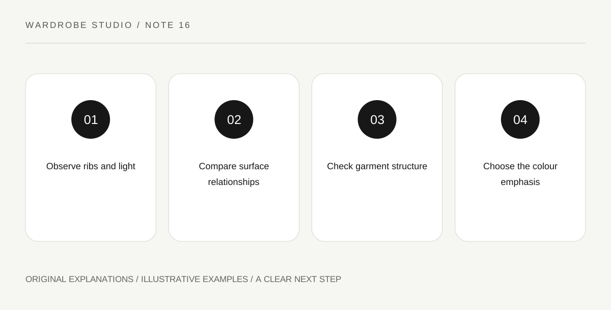
Original explanatory diagram. Read the full method and limitations below.
Look at rib scale and light
Fine and broad ribs create different visual activity. The direction of the pile and the light can make parts of a garment appear lighter or darker, so inspect it in the conditions where you will wear it. A colour name alone does not describe the whole surface.
Lay the corduroy beside a smooth fabric of similar colour. Notice whether the contrast comes mostly from shadow, sheen or texture. This makes the styling decision more precise than saying the materials do not match. Different surfaces can be intentionally combined without requiring identical appearance.
Check knee and elbow movement where relevant, since a textured surface does not tell you how much ease the finished pattern includes.
Choose whether to repeat or contrast texture
A ribbed knit can echo corduroy’s lines, while a smooth shirt can make them more noticeable by contrast. A second coarse texture may create a deliberately tactile outfit. Try the actual pieces instead of assuming every textured garment must be balanced with a smooth one.
Consider how much of each surface is visible. A small collar and sleeve area produces a different effect from an entire second textured garment. You can enjoy a strong contrast while keeping its area limited, or choose a larger repeated texture for a more enveloping effect.
Read the garment’s construction separately
Corduroy trousers, a skirt and a jacket have different shapes even when their surface is similar. Pockets, seams and lining influence fit and movement. Do not assume a soft-looking fabric means the finished garment will feel loose or unstructured.
Sit, bend and reach in the intended combination. Check whether adjacent textured surfaces catch or add bulk where garments overlap. If the interaction feels uncomfortable, change the companion or arrangement. The question concerns finished items in use rather than a broad promise about any fibre or fabric category.
Choose colour by the effect you want
Earth colours are one possible direction, but corduroy can be bright, pale or dark. A vivid corduroy garment already combines colour emphasis and texture. You may choose quiet companions to make it lead, or repeat its energy intentionally.
For an exercise, use one corduroy item with a smooth companion and then a similarly textured one. Keep the main colours comparable. Note which version feels clearer or more interesting to you, and follow the actual care label before attempting any treatment that might change the pile.
Illustrative texture comparison
A wearer owns deep-purple corduroy trousers. A smooth pale shirt makes the rib texture visible through contrast. A purple ribbed knit creates a more tactile, connected effect but feels bulky at the waistband. They choose the shirt for a long seated day and the knit for a shorter casual outing, without restricting corduroy to brown or rust.
Practical checks
Optional checkboxes save only in this browser.
Questions that come up
Must corduroy be worn only in earthy colours?
No. Colour is a design choice, and the surface can work in many palettes. Assess the actual garment and your intended emphasis rather than treat a common association as a rule.
Can I brush or press it to change its appearance?
Follow the finished garment’s instructions and seek appropriate advice if uncertain. Unsupported heat or surface treatment can alter pile or colour appearance. Styling should not require a care method the garment does not permit.
References and scope
These sources support the factual background. Examples and exercises are original illustrative teaching material. References do not imply endorsement.
- Getty Museum: Principles of design — Vocabulary for visual weight, emphasis, repetition, balance and proportion used in original outfit exercises.
- Getty Museum: Elements of art — Distinguishing line, shape, color value, intensity, space and texture.
- V&A: Textiles collection — Distinguishing printed, woven, embroidered and other textile surfaces.
- ACCC: Care labelling on clothing and textiles — Following care instructions for the finished garment rather than assuming treatment from appearance.